
It’s been a while since my last update. I’ve wanted to share a small project I’ve been working on over the past few months! As an avid cyclist, I love biking around Seattle, whether it’s heading to class, work, or just running errands. I live in Ballard near the Burke Gilman Trail, one of the flatter parts of Seattle, so I can often avoid Seattle’s notorious hills. While Seattle is great for biking compared to other cities, its bike infrastructure could definitely be improved. One way to assess bike facilities and look for new opportunities is to study bicycle collision data to identify hotspots and trends. Additionally, for the city to meet its Vision Zero goals of having no serious injuries or traffic fatalities, it needs to understand where and how collisions are happening. Fortunately, the City of Seattle makes all of this data available online! Below I will share some of my findings from this analysis.
Data
The dataset comes from data.seattle.gov, where all collision data in the City of Seattle is collected by the Seattle Department of Transportation (SDOT) and posted. Though the data appears as a map with points, it can be downloaded as a csv for analysis. Since I am looking only at collisions involving bicycles, I filtered only the observations where COLLISIONTYPE is “Cycles”. I downloaded this dataset in March 2017 originally, so it does not have summer 2017 data included in it.
You can find the filtered dataset and source code for this analysis on my Github page.
# Set working directory
setwd("~/Documents/R Files/Seattle Biking")

# Libraries
library(ggplot2)
library(readr)
library(dplyr)
library(lubridate)
library(ggmap)

# Read in data file
bikedat <- read_csv("SDOT_Collisions.csv", guess_max = 1500)

# Convert incident date, incident time to date and time classes
bikedat$INCDATE <- mdy_hms(bikedat$INCDATE)
bikedat$INCDTTM <- parse_date_time(bikedat$INCDTTM, orders = "mdy IMS p")

# Extract latitude and longitude from shape variable
  # Lat: take substring of Shape variable
bikedat$Lat <- as.numeric(substr(bikedat$Shape, start = 2, stop = 18))
  # Long: Split Shape at ", " and unlist (lapply) to get 2nd element,
  # then take substring to trim the ")" and convert to numeric
bikedat$Long <- as.numeric(substr(lapply(strsplit(bikedat$Shape, ", "), '[', 2), start=0, stop = 13))
Where Are Collisions Occurring?
For some initial exploration, I played around with mapping the data using ggmap and the latitude and longitude information in the dataset. One thing I found interesting is that the vast majority of bike collisions actually happened during daylight. I expected there to be more collisions at dark or dawn/dusk, when there is less light to see cyclists. However, there is also usually more traffic on the road during the day, so there are more chances of a collision occurring. The following map shows the distribution of collisions in 2017. It looks like most collisions happen downtown and in the central neighborhoods.
# Get Seattle map data
seamap <- get_map("Seattle", maptype = "roadmap", zoom = 11)

# Map of 2016 collisions, colored by time of day
m.2016 <- ggmap(seamap) +
  geom_point(aes(x=Long, y=Lat, color=factor(LIGHTCOND)), data = bikedat[year(bikedat$INCDATE)==2016,])+
  labs(title = "Most Collisions in 2016 Happened During Daylight",
       color="Light Conditions")
m.2016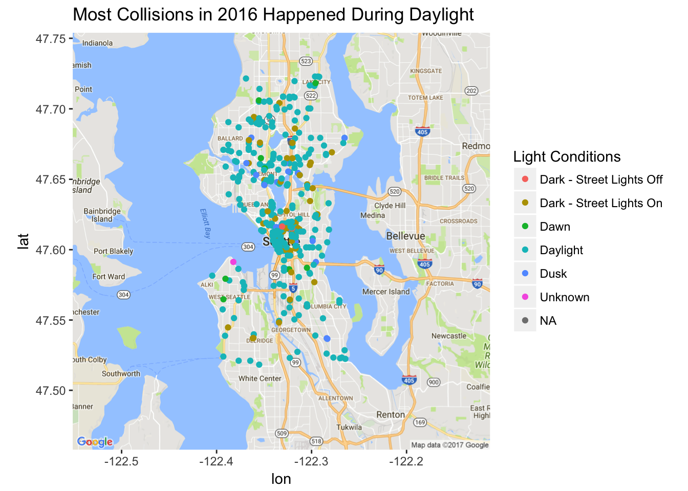
Who Ran Into Whom?
Another thing I wondered about was who usually hit whom during a collision. SDOT actually provides this information with the “SDOT Collision Code”. There are several dozen collision codes, but they can be combined into a few main categories: a vehicle in operation hit someone else, a driverless vehicle hit someone, a cyclist hit someone else, a pedestrian or non-traffic cyclist hit someone, or a pedestrian hit someone. Using this information, I created the Striker variable to make it easier to organize the observations. While this variable does not say who is legally at fault for a collision, it does answer the question of “who ran into whom” for a given collision.
# Create variable "Striker" to describe "Who Hit Whom", which can be determined from SDOT collision code
# dplyr's case_when() is useful for a more readable if-else syntax
bikedat <- bikedat %>%
mutate(Striker = factor(case_when(.$SDOT_COLCODE >= 10 & .$SDOT_COLCODE <= 29 ~ "Vehicle in Operation",
.$SDOT_COLCODE >= 30 & .$SDOT_COLCODE <= 49 ~ "Driverless Vehicle",
.$SDOT_COLCODE >= 50 & .$SDOT_COLCODE <= 69 ~ "Cyclist",
.$SDOT_COLCODE >= 70 & .$SDOT_COLCODE <= 76 ~ "Pedestrian or Non-Traffic Cyclist",
.$SDOT_COLCODE >= 80 ~ "Pedestrian Struck",
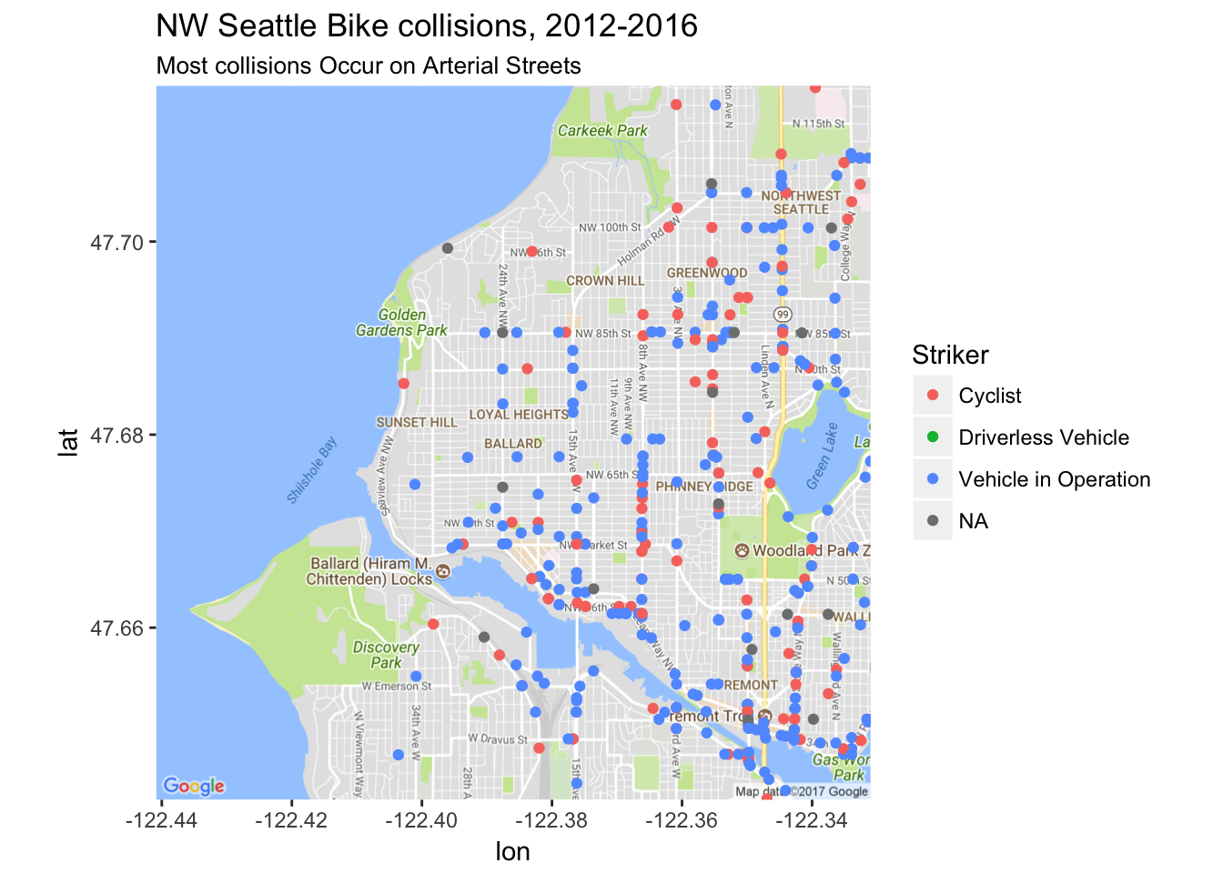
TRUE ~ as.character(NA))))From mapping the data and zooming in just on my neighborhood of Ballard and the other neighborhoods of Northwest Seattle, we can see a few interesting findings. First off, it looks like most collisions occur on arterial streets, such as 8th Ave NW, 15th Ave NW, NW 85th Street, Leary Way, and Nickerson St. Additionally, the majority of collisions involved a vehicle in operation striking a cyclist. However, there are still a decent amount of collisions where the striker was a cyclist hitting someone else. Only a few observations had missing (NA) data, and no collisions were caused by a driverless vehicle.
How are Collisions Changing Over Time?
This made me wonder about whether these collisions are changing over time. Unfortunately, the number of collisions is on an upward trend, as is the proportion of collisions where the striker is a vehicle.
bikedat %>% group_by(year(INCDATE), Striker) %>%
  summarise(n = n()) %>%
  rename(year = `year(INCDATE)`) %>%
  ggplot(aes(x=year, y=n, fill=Striker))+
  geom_col()+
  labs(y="Number of Collisions",
        x="Year",
       title="Collisions Have Increased Over Time",
       subtitle="Proportion of collisions Caused by Vehicles Increasing")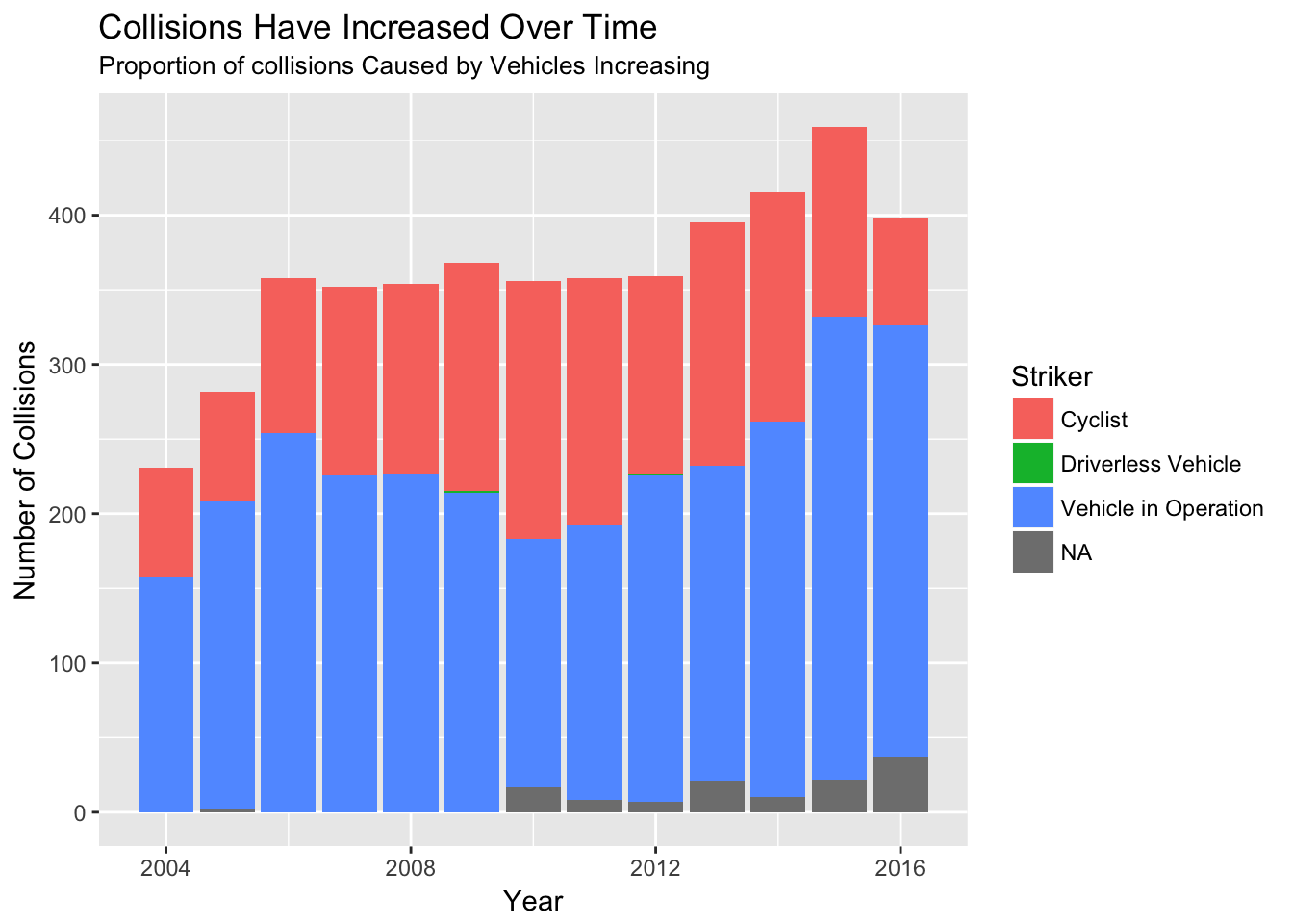
bikedat %>% group_by(year(INCDATE), Striker) %>%
  summarise(n = n()) %>%
  rename(year = `year(INCDATE)`) %>%
  ggplot(aes(x=year, y=n, fill=Striker))+
  geom_col(position = "fill")+
  labs(y="Proportion of Collisions",
       x="Year",
       title="Collisions Have Increased Over Time",
       subtitle="Proportion of collisions Caused by Vehicles Increasing")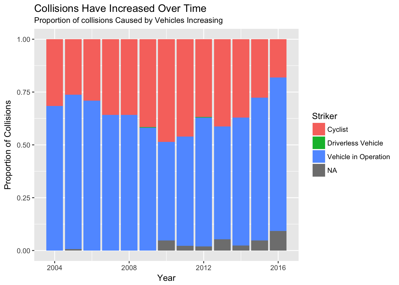
This upward trend may be driven in part by the fact that Seattle’s population is booming, so the number of cars and bikes on the road has increased. This means there are simply more opportunities for a collision to occur. However, the rising number of collisions suggest that the status quo will not suffice if the city wants to meet its Vision Zero goals. I’m a big fan of protected bike lanes, which can greatly reduce the risk of an accident on a given street compared to riding a bike in a bike lane or mixed with traffic.
Where on the Street Do Most Accidents Occur?
Perhaps not surprisingly, the most common location for a collision is at an intersection. About half of all collisions occur at an intersection, followed by mid-block, not related to an intersection. We can also see that these two collision types also make up most of the increase in collisions over the past several years, as other junction types for collisions have stayed relatively flat.
bikedat %>% group_by(year(INCDATE), JUNCTIONTYPE) %>%
  summarise(n = n()) %>%
  rename(year = `year(INCDATE)`) %>%
  ggplot(aes(x=year, y=n, group=JUNCTIONTYPE, color=JUNCTIONTYPE))+
  geom_line()+
  labs(y="Number of Collisions",
       x="Year",
       color="Junction Type",
       title="Most Collisions Are At Intersections")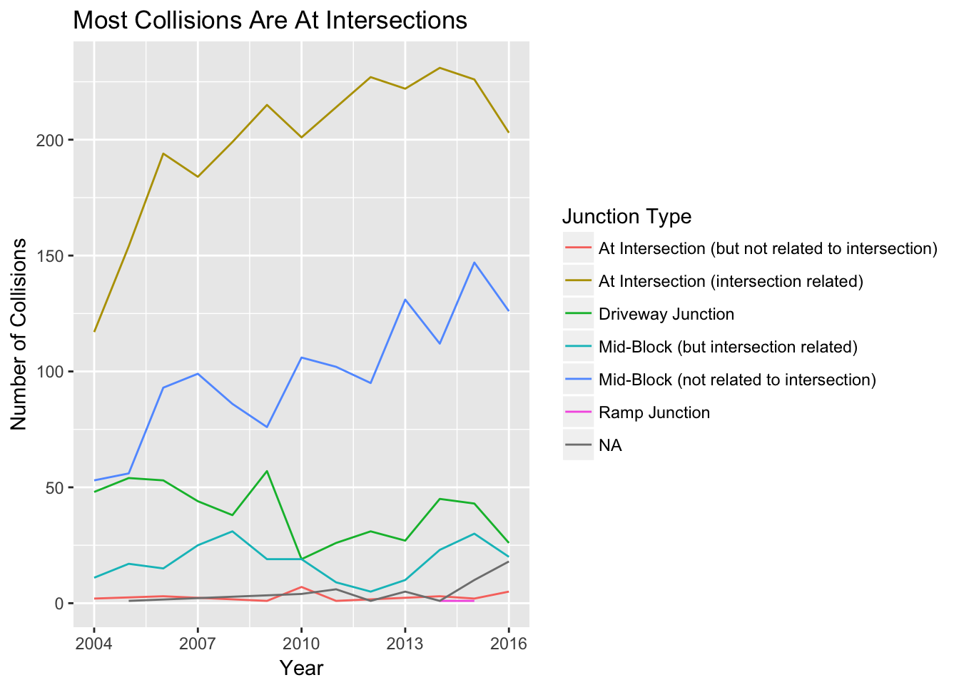
Does Weather Play a Role in Collisions?
Though Seattle is generally known as a dark, wet, and rainy city, I wondered if those same conditions play into whether a collision occurs. As noted above, most collisions actually occur during the day, not when it’s dark out. Perhaps surprisingly, the following graphs also show that about 75% of collisions happen when the weather is clear or partly cloudy or when the road is dry. There is a noticeable subset of observations that occur in wet conditions and when it is overcast or raining, and relatively few collisions in other conditions. Perhaps it is not surprising that there are more collisions in favorable weather conditions, as there are many more people biking on nice weather days than in the cold, dark winter months!
bikedat %>% group_by(year(INCDATE), ROADCOND) %>%
  summarise(n = n()) %>%
  rename(year = `year(INCDATE)`) %>%
  ggplot(aes(x=year, y=n, fill=ROADCOND))+
  geom_col(position = "fill")+
  labs(y="Proportion of Accidents",
       title="Most Accidents Have Dry Road Conditions")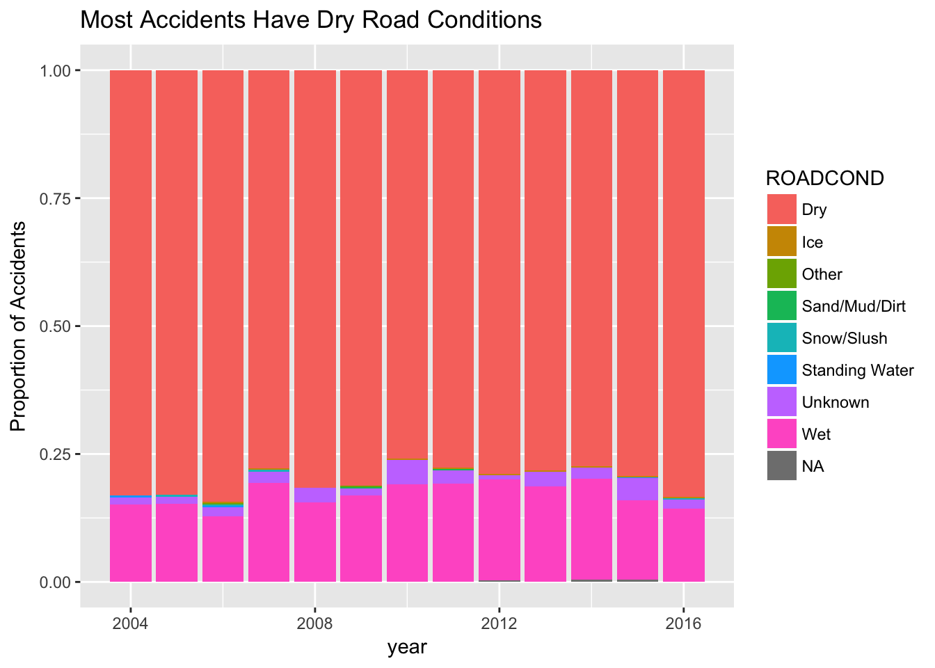
bikedat %>% group_by(year(INCDATE), WEATHER) %>%
  summarise(n = n()) %>%
  rename(year = `year(INCDATE)`) %>%
  ggplot(aes(x=year, y=n, fill=WEATHER))+
  geom_col(position = "fill")+
  labs(y="Proportion of Accidents",
       title="Most Accidents Have Clear Weather Conditions")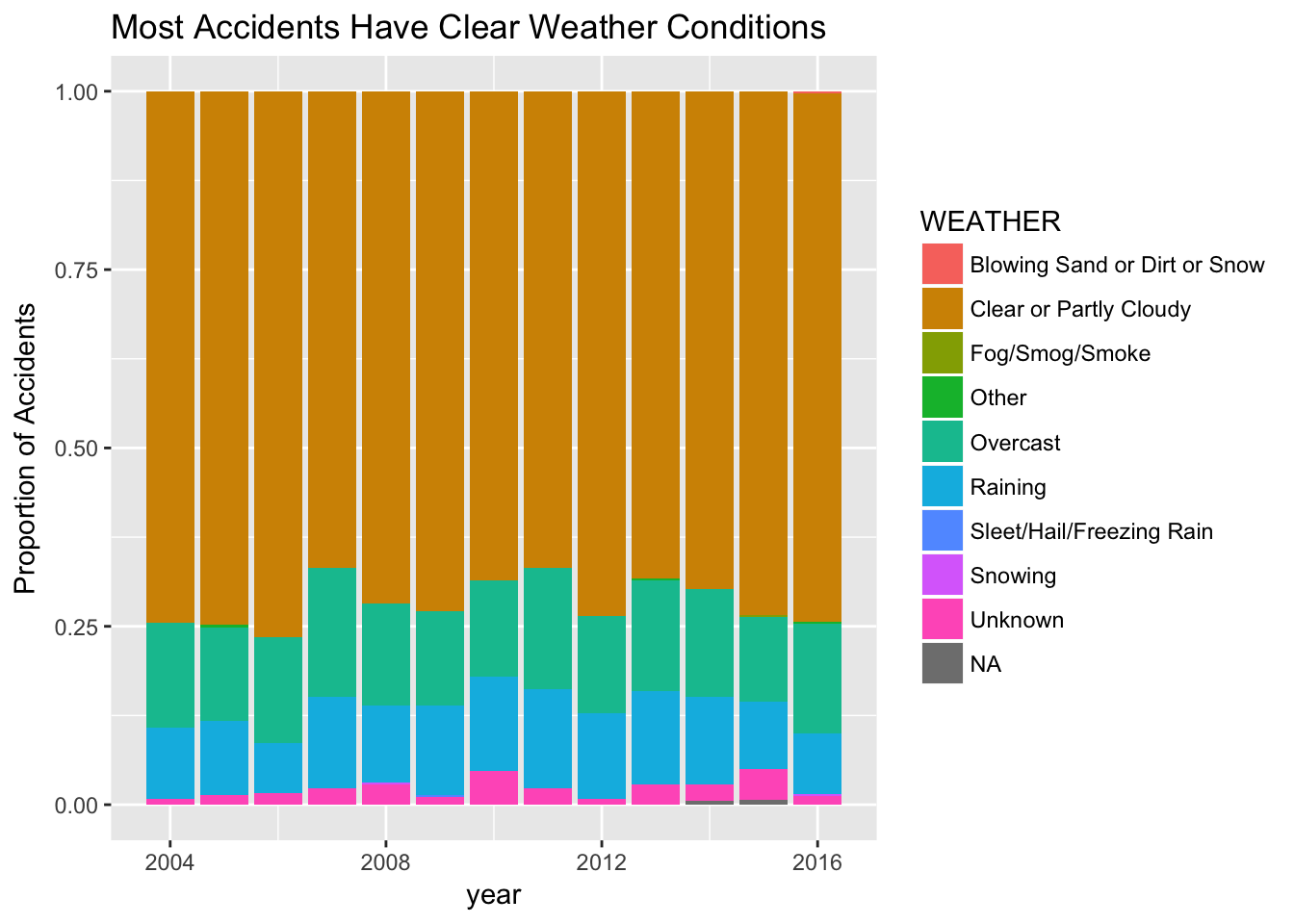
Conclusion and Further Exploration
These are some of my main findings for collision data involving bikes in Seattle. Some of the main takeaways are that you should be extra careful when biking along arterials, at intersections, or during rush hour when the chance of a collision is higher. And always wear a helmet! Though I know it can be a divisive issue, I’m firmly in the camp that I would rather put up with the inconvenience or discomfort of a helmet than risk a head injury without one.
I’m hoping to spend some more time with this data and do a deeper dive into what factors can help explain collisions. For example, looking just at collisions at intersections may be associated with different weather and road conditions, time of day, striker, and other factors than collisions occurring mid-block. I will have to save that exploration for another blog post!
Additionally, since I originally downloaded this data in March, the launch of new bikesharing companies Spin, Limebike, and Ofo in Seattle are not included in this analysis. I definitely want to keep exploring this data and see if there is a noticeable change in collision data from the rise in new bikeshare companies.
As mentioned above, you can find the filtered dataset and source code for this analysis and some other visualizations on my Github page.
